Introduction
In a world flooded with digital noise, advertisement poster design remains one of the most powerful tools for capturing attention—both online and offline. From billboards and social media creatives to in-store displays and event promotions, posters still influence buying decisions more than many brands realize.
However, poster design in 2025 is no longer about just “looking good.” It’s about strategic storytelling, psychology-driven visuals, and platform-specific optimization. With evolving design trends, AI tools, and audience expectations, brands that fail to adapt risk being ignored entirely.
This guide breaks down the top 7 advertisement poster design tips for 2025, based on real industry practices, user behavior insights, and marketing trends. Whether you’re a designer, marketer, or business owner, these tips will help you create posters that don’t just attract views—but drive action.
Design with a Clear Objective First
Before opening any design tool, define one clear goal for your advertisement poster design.
Why Purpose-Driven Design Matters
Many posters fail because they try to communicate too much at once. In 2025, attention spans are shorter than ever. Your poster should answer one question instantly:
What do I want the viewer to do?
Common Poster Objectives
- Promote a product or service
- Announce an event or sale
- Build brand awareness
- Drive website traffic or QR scans
Every element—headline, colors, imagery, and CTA—should support that single objective. Posters with a focused message perform significantly better across both physical and digital environments.
Use Visual Hierarchy to Guide the Eye
Visual hierarchy is the backbone of effective advertisement poster design. It controls how viewers process information within seconds.
Key Elements of Strong Visual Hierarchy
Headline First, Always
Your headline should be the most dominant element. Use:
- Large, bold typography
- High contrast colors
- Clear, benefit-driven language
Supporting Visuals Second
Images or illustrations should reinforce the message—not distract from it. In 2025, audiences prefer authentic visuals over generic stock photos.
CTA Comes Last
Your call-to-action should be obvious but not overpowering. Buttons, arrows, or highlighted text work well, especially for digital posters.
A well-structured hierarchy ensures your message is understood even from a distance—or while scrolling fast.
Choose Typography That Matches the Message
Typography trends in 2025 lean toward bold simplicity with personality. Fonts are no longer decorative extras; they’re communication tools.
Best Typography Practices for Posters
- Use 1–2 font families only
- Pair a bold headline font with a readable body font
- Avoid overly thin fonts for outdoor or mobile viewing
- Ensure accessibility with proper spacing and contrast
Pro Tip from Experience
In real campaigns, posters with clean sans-serif fonts consistently outperform decorative fonts when tested across social ads and physical displays.
Typography should enhance clarity, not compete for attention.
Leverage Color Psychology and Contrast
Color directly affects how people feel and react to your poster. In 2025, brands are becoming more intentional about color choices in advertisement poster design.
Popular Color Trends for 2025
- Earth tones for sustainability-focused brands
- Neon accents for tech and youth markets
- Minimalist monochrome for premium positioning
Contrast Is Non-Negotiable
No matter the trend, contrast is critical:
- Text must stand out from the background
- CTAs should be instantly visible
- Avoid color combinations that strain the eyes
Strong color contrast improves readability, brand recall, and conversion rates.
Optimize Poster Design for Digital-First Platforms
While posters still exist physically, most are now viewed digitally first—on Instagram, websites, ads, or WhatsApp.
Digital Optimization Essentials
- Design in multiple aspect ratios (square, portrait, landscape)
- Ensure text is readable on mobile screens
- Avoid tiny details that disappear on smaller devices
- Compress images without losing quality
A modern advertisement poster design should be responsive in mindset, even if it’s printed later.
Brands that adapt posters for digital distribution consistently achieve wider reach and higher engagement.
Use Minimal Copy with Maximum Impact
In 2025, less truly is more.
Why Short Copy Works Better
Users scan posters, they don’t read them. The most effective advertisement poster designs use:
- One strong headline
- One supporting line (optional)
- One CTA
Examples of Effective Poster Copy
- “Limited Time. Unlimited Style.”
- “Launch Faster in 2025.”
- “Scan. Save. Smile.”
If additional details are needed, direct users to a website or QR code instead of cluttering the poster.
Build Trust with Branding and Credibility Signals
Trust plays a huge role in whether someone acts on a poster message.
Essential Trust Elements to Include
- Clear brand logo placement
- Consistent brand colors
- Social proof (awards, ratings, testimonials)
- Website or social handle
For businesses looking to improve visibility and conversions, working with professionals or seeking SEO Expert Help from can ensure that design and digital strategy align seamlessly.
Credibility makes your advertisement poster design feel legitimate—and legitimacy drives action.
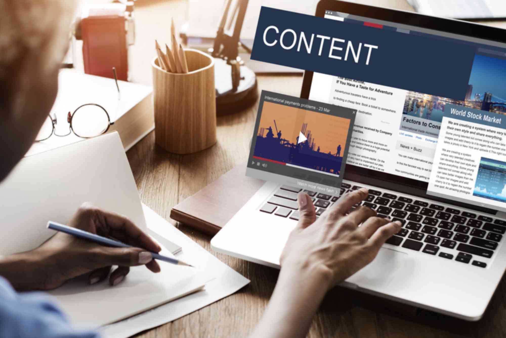
The Role of Content Strategy in Poster Design
Poster design doesn’t exist in isolation. It’s part of a broader content and marketing ecosystem.
Organizations like the Content Marketing Institute emphasize that visual assets should support a consistent brand story across all channels.
When posters align with your content strategy:
- Brand recognition increases
- Campaign messaging becomes clearer
- Marketing ROI improves significantly
In 2025, the best posters are those that fit naturally into a larger marketing narrative.
FAQs
What makes a good advertisement poster design?
A good advertisement poster design has a clear goal, strong visual hierarchy, readable typography, effective color contrast, minimal copy, and a clear CTA.
How many words should an advertisement poster have?
Ideally, fewer than 20–30 words. Posters should communicate the message instantly without overwhelming the viewer.
Which software is best for poster design in 2025?
Popular tools include Adobe Illustrator, Photoshop, Canva Pro, and Figma. The best choice depends on your design skill level and collaboration needs.
How do I design a poster for both print and digital use?
Start with high resolution, use scalable fonts, maintain strong contrast, and export multiple sizes optimized for different platforms.
Why is advertisement poster design still important?
Despite digital growth, posters remain highly effective for brand awareness, local marketing, events, and promotions—especially when integrated with digital strategies.
Design Posters That Actually Convert in 2025
The future of advertisement poster design is strategic, intentional, and user-focused. In 2025, successful posters don’t rely on flashy visuals alone—they combine psychology, clarity, branding, and platform awareness.